“There’s no point in being naive, or ignorant, you need a strong message to help you survive and flourish in this industry. The quality of the beer should be paramount, but effective branding improves your chances,” explains a confident Stuart Kellock, managing director of labelling and packaging manufacturer Label Apeel.
The Leicester-based business adheres to the consensus that you consume a beer before you actually drink it, and attractive, effective branding goes some way to helping swing that purchase decision.
It’s no secret that good packaging sells a product, so it’s no surprise that breweries continue to place an increasing emphasis on the way their bottles and cans look when they hit the on- and off-trade. There is no ‘one size fits all’ approach for the way beer styles look across small-pack sales and that in itself, makes the packaging proposition across the UK’s 1,700 breweries all the more exciting.
“We have seen is towards a more professional look in beer branding. I don’t think anyone is kidding themselves now that if they want to make the business work, it needs to be professional from the brewing to the brand itself,” explains Kellock. In my opinion, the logo has to be strong, the message, the brand. We are moving away from the comedy names and cartoons that graced older brands so, while there is a physical maturing of the industry, there is also a very noticeable one across branding, too.”
He adds: “People are thinking about what they want to portray and how best to reflect the values of their brewery. They are dealing with their marketing and presentation on a more mature basis and I think that’s a reflection of how the beer-consuming demographic is much wider now, too.
According to Kellock, effective beer branding helps a brewery convey its value to the customer in question.
“People want to invest in the value of that brewery and the beer they are drinking. Be that if it’s a locally-sourced product, or perhaps the beer or brewery observes an age old tradition, it’s about reflecting that on the label. It’s essential,” he says. “But you also need to do in an attractive way that makes it jump off the shelf. It needs to do a lot at the same time, it’s a fine balance.”
Kellock is keen to mention that that Label Apeel will advise and point clients in the right direction when they believe the beer label is undermining the product they are selling.
“If we think the work isn’t up to scratch from their side, we will let them know. We will err on the side of the caution in our approach but ultimately, we won’t be supplying them many more labels as that beer is going to face a challenge when it comes to selling in any great volume,” he adds.
Speaking to Simon Smith, managing director of CS Labels earlier in 2016, he said that breweries will continue to spend more on their branding going forward.
“The successful ones tend to invest in their marketing which goes right through to the packaging. Packaging, including the label, isn’t something they want to skimp on as they know consumers make a lot of buying decisions based on quality packaging in this market,” he said at the time. “Plus most brewers are proud of their work; they genuinely love their craft and why spoil a fantastic beer with a cheap label? Also if you look at many of the recent award winning labels, they were either gins or beer.”
Fast-forward to the end of 2016, Smith’s company reinforces this, and has the accolades to back it up. “You need to offer something different. Every year. If you get results from the branding you help suggest, then people trust you as a result,” he says.
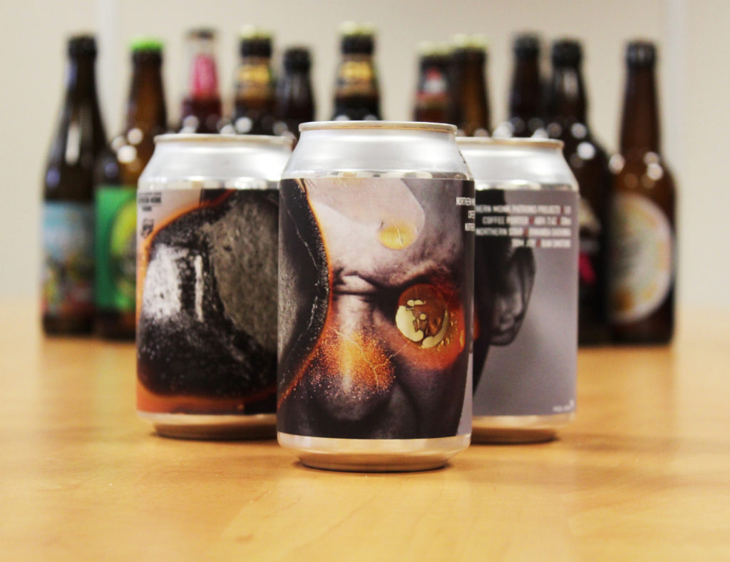
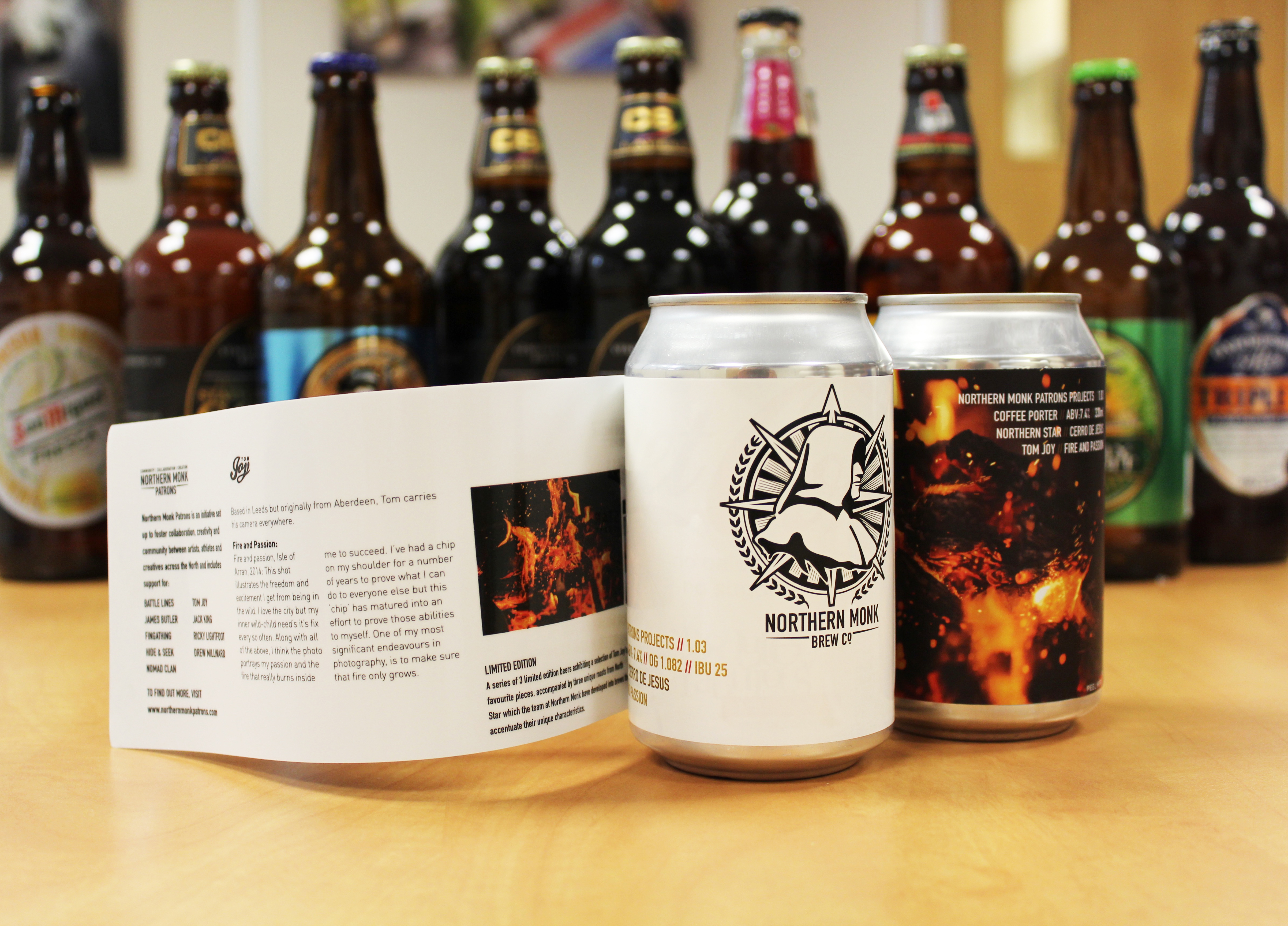
One recent project CS Labels has been recognised for the peel and reveal label it produced for Northern Monk Brewery’s Patrons Project (Coffee Porter), which was carried out on its Xeikon CX3 press and GM DC330 finishing line.
The Northern Monk Patrons Project is designed to foster collaboration and community between artists, athletes and creatives across the North. The beer in question use roasts from North Star Coffee Roasters, and are adorned with stunning artwork and photography by Leeds based Tom Joy.
“Initially they came to us to request a standard peel and reveal using just white material. We suggested using a silver polypropylene face instead and some other tricks and tips to make the most of this special edition,” says Smith. “Northern Monk obliged, trusted us, and gave us poetic license on the label’s structure and artwork.”
He adds: “Adam’s team changed the middle left page to allow for the silver face material to shine through and create a metallic look. The labels are able to illustrate all three pieces of photography in their glory on the inside, and show off the main version on the outside. You can also read about the project and brewing notes. The addition of the double sided silver is a special solution developed by us.”
Mike Impson is the sales director at Saxon Packaging, a company that has supplied packaging products to a number of UK breweries and contract filling companies, among others. Beer-related sales now account for around 8% of business at the company.
“We have been fortunate to deal with breweries for many years. Lots of customers come to us to look at the corrugated packaging options available to them, whether that be a box for 24 cans or a gift pack for a limited edition beer. Lots of breweries start by opting for one colour on the packaging but our ability to offer three colours in one pass proves very attractive,” he says. “With print, there are no longer any boundaries, from simple one-colour prints to photographic quality output, there is something for everyone.”
Several examples of the work Saxon has carried out is with Beavertown and Five Points Brewing Company, two London breweries.
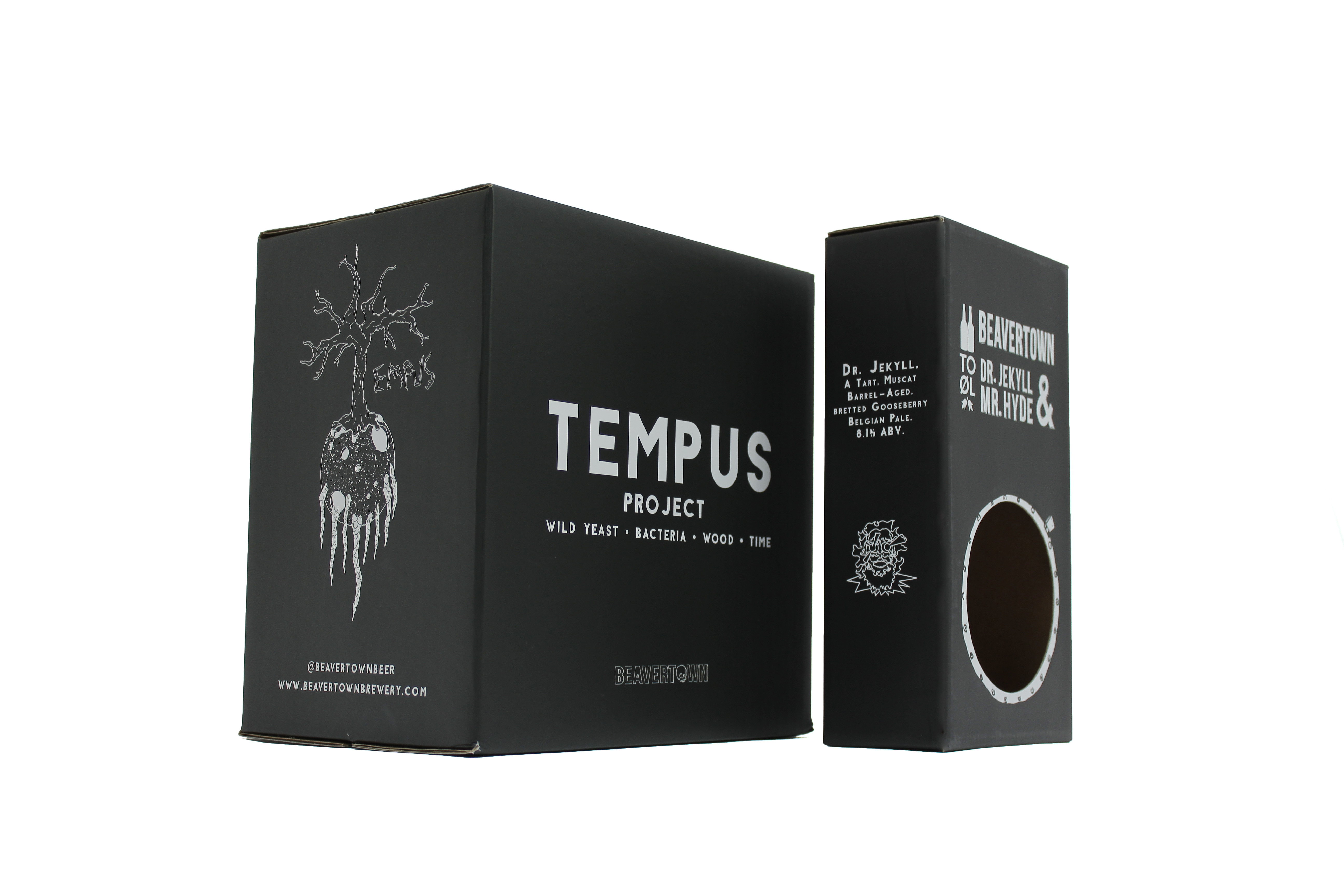
Towards the end of last year, Beavertown tasked Saxon with the production of a bespoke gift pack for its Dr. Jekyll & Mr. Hyde beers, two collaborations with Danish brewery To Øl.
“The beer we produce is to the highest standard we could possibly achieve; we give it our all. We’ve always approached our branding and design the same way, attempting to keep it on par with our beer so we wanted a gift pack that reflected this” explain Nick Dwyer, creative director of Beavertown Brewery.
Beavertown’s packaging had previously been flexographically printed. However Saxon recommended a lithographic print with a matt laminate finish using e-flute corrugated board 150K/150T. Following successful results on the Dr. Jekyll & Mr. Hyde gift packs, Beavertown also returned to the manufacturer for its ongoing Tempus Project series of barrel-aged beers.
Having been so impressed with the quality and eye catching print finish of their Dr. Jekyll & Mr. Hyde gift packs that when it came to Beavertown’s more recent brew ‘The Tempus Project’ lithographic printed packaging was “an easy choice” said Nick, he also continued to say “the feel is simply more premium”.
“As a brewery known for its considered packaging its nice when people notice we’ve stepped it up further still, and that was absolutely the case with both of these projects.” adds Dwyer.
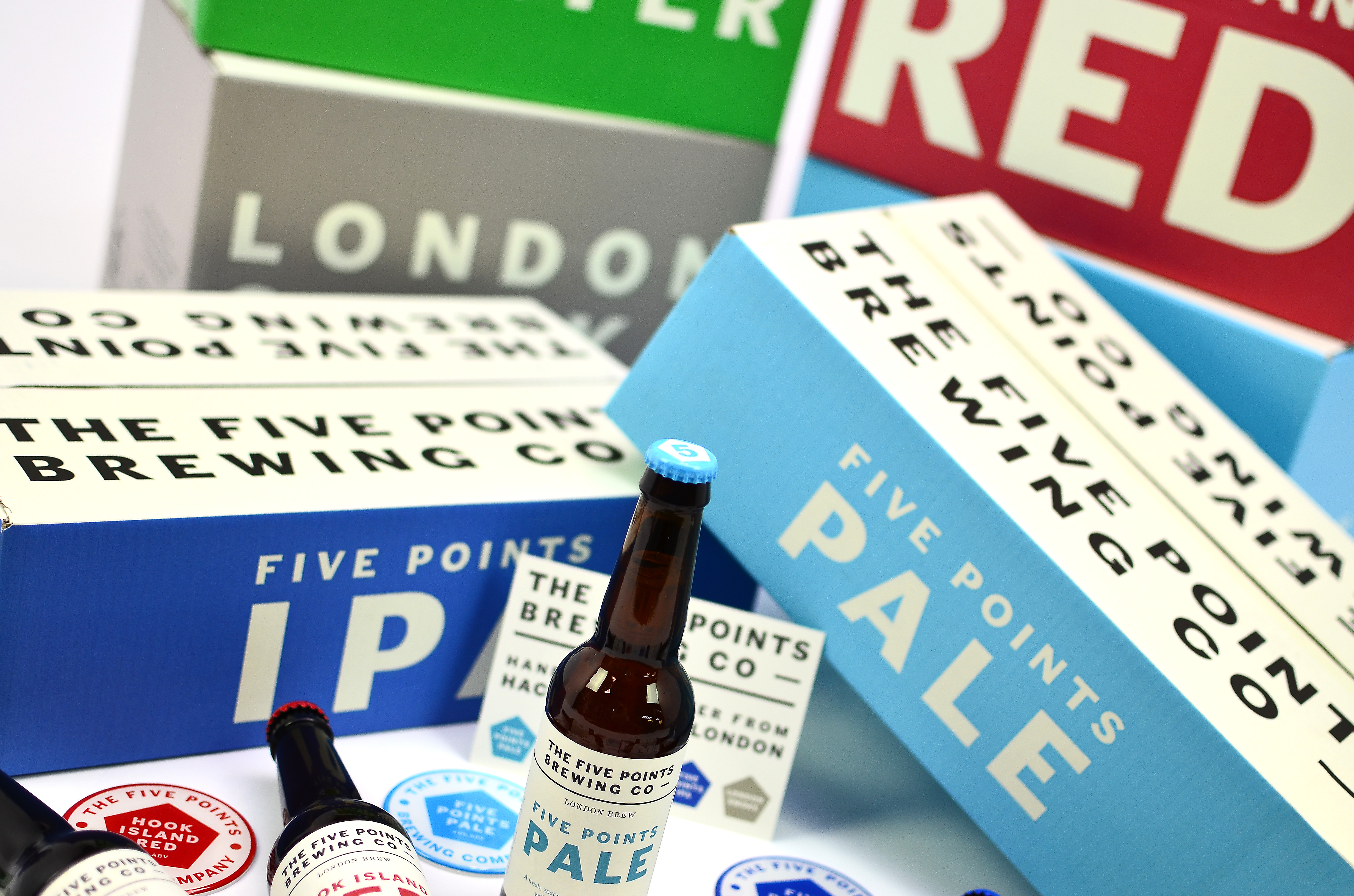
For its work with Five Points Brewing Company, Saxon cemented its existing relationship with the Hackney-based brewery in the summer of 2015 through supplying the boxes for its canned beers.
“Kate Lyons, the graphic artist behind The Five Points’ visual branding, created the striking visual design of the boxes. The concept behind the design mimics the brewery’s can designs and draws upon the rest of the strong branding for each of The Five Points’ core range of beers,” says the manufacturer.
Doreen Joy Barber, communication, events & marketing manager at The Five Points Brewing Company, explains: “Kate Lyons has created a clean and classic look that still manages to be bold and eye-catching, yet also contain all the key information such as amount of bottles, size of bottles, alcohol by volume and so forth.”
Once the visual artwork was finalised, Kate worked with Saxon’s in-house design team to develop the final box design. Several weeks later the design was deemed so successful that The Five Points extended the design onto its bottle boxes as well.
Saxon referred to the Pantone colours from Kate’s artwork and the existing branding of The Five Points, and provided samples of the ink to be featured on the packaging. The process of getting the colours exactly right involved extensive consultation with Ed Mason and Greg Hobbs, including sending copies of the brewery’s bottle labels to the ink supplier in order for them to match the tone directly.
Previous experience allowed the manufacturer to specify an exact grade of material for the boxes. Due to the cans generally being damp when being packed, a kraft inner liner and a waste based fluting was recommended to help deal with the moist packing conditions.
“Printing onto a white substrate ensured the chosen colours remained bright and bold. The bottle boxes remained in the same grade as the original packaging albeit they were switched to a white outer liner to make the most of the colours once more,” says Impson. “With the cream being printed first, we added additional wax to the ink recipe to ensure it dried in time before the 2 additional colours were laid down to prevent ink rub across the design and ensure a quality print finish.”
He adds: “Having supplied Five Points Brewing with their previous two-colour brown boxes, we were really pleased that we were chosen to work on their new boxes. The finished design and results ensures their packaging remains consistent with their overall brand look and feel. The print process we used was also a very economical solution given the number of designs.”
Elsewhere, Charlotte Taylor, marketing manager at glass packaging manufacturer Beatson Clark, echoes Kellock’s point saying “brewers are only too aware that their branding needs to be on point”.
She says: “From a visual perspective that means their bottles and their labels need to work together to create an eye-catching impression on the shelf. Most beer brands realise that they need distinctive packaging compared to their competitors. Because of budget restrictions and minimum volume restrictions many smaller breweries have to use the same standard bottles; fortunately the range of standards available has expanded a lot over recent years. The bottles that really stand out, however, are the bespoke shapes and embossed designs, as well as the bottles with individual, modern labels that look really bold and appealing.
“In years gone by small producers were keen to promote the heritage and quality of their product and so went for a traditional look; but the craft beer movement has breathed life into what was quite a conservative industry and trendsetters such as BrewDog and Bedlam have taken the market in a more modern and youthful direction.
“Nowadays, if you want your beer to stand out on the supermarket shelf, a contemporary look, shape and feel are key. We have supplied bespoke bottles to BrewDog and standard bottles to Bedlam Brewery, for example, and both brands have used creative decoration to create unique and distinctive packaging for their beers.
“Decoration techniques mean there are now many different options when it comes to further improving the look and feel of a bottle – as well as the different shapes, styles and colours that are available, we can also use textures, sleeving, printing and spraying to create a unique look.”
She highlights the recent work Beatson Clark has carried out with breweries such as BrewDog and Bedlam Brewery.
The former commissioned the manufacturer to supply 375ml Champagne-style amber beer bottles for its Abstrakt range of beers.
Recent additions to the Abstrakt range include AB19, a 13.1% blend of two barrel-aged imperial saisons and AB20, a 14.2% Tiramisu oatmeal milk barley wine; a blend of an English barley wine brewed with coffee, oats and milk and a complex rum cask-aged imperial stout.
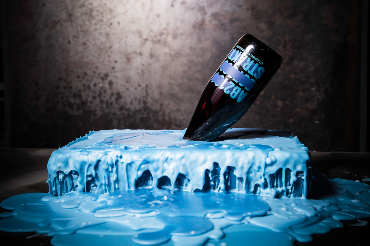
Its most recent launch was AB21, a 12% liquorice and blackcurrant infused imperial stout.
The new 375ml bottle, which features the BrewDog logo embossed on the shoulder, complements the 660ml Vichy beer bottle Beatson Clark already supplies the company.
Chris Palmer, business development manager at Beatson Clark, explained: “We’ve worked with BrewDog for several years so we’re pleased that they have come back to us for this special design.
“Our in-house design service is second to none and something which customers really appreciate. We are also able to manufacture bespoke bottles at small volumes, which almost certainly helped us to win the contract in this case.”
For West Sussex-based Bedlam Brewery, the company took Beatson Clark’s standard 330ml amber beer bottle and gave it a twist with colourful artwork screenprinted onto the glass by Yorkshire Bottle Solutions.
“We try to minimise packaging and have been able to opt for a screen-printed bottle over a printed label to lessen any excessive waste,” says managing director Dominic Worrall. “All glass bottles can be fully recycled, which is something we actively encourage and promote.”
When it came to finding a UK supplier for its bottles, Worrall says flexibility was the key.
He explains: “We were looking for a quality UK manufacturer that was happy to work in supporting a new start-up business like ourselves,” he explained. “Beatson Clark offered great flexibility and reassurance when walking us through the ordering process for the first time.
“They also offered us a quality design not often found and at a fantastic price point. It was important to us to support UK manufacturing and in Beatson Clark we found the perfect partner.”