
TBJ: The designs for many of Pig & Porter’s beers have changed and developed over time. How does this process take place? What were the key changes the team at the brewery wanted when working with you?
Pig and Porter have actually always been making really good beer, the only problem was that the branding did not reflect this; I wanted to create a design that showed just how exciting the beer was.
There was no identifiable branding or unity amongst the different elements of the branding and the name Pig and Porter often led people to believe that the style of the beer was a Porter, because there was a lack of distinction between the Logo and the rest of the information displayed on the Pump Clips, Badges and bottles.
In an attempt to rectify this problem there were two logos being used on all of their badges, which was creating further confusion. We identified that there needed to be a clear logo, and that there should be a unity amongst all elements of the branding.
Do you work with Sean and Robin when new beers are being developed to put together ideas for the design, or is that something you work on once the name and style of beer are settled on?
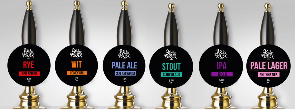
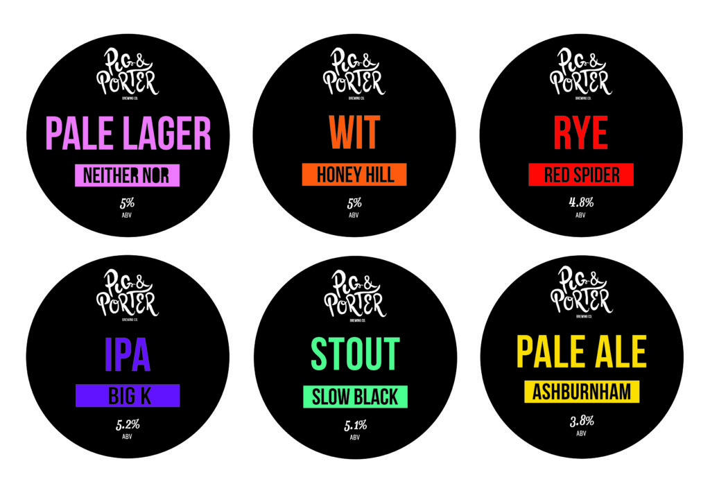
Unfortunately I can’t take credit for any of the names that they think of. The design I created follows a system, each beer has a colour and illustration which is created, based on the name and or style of the beer. This colour is then used against black for the beer clips and badges and a solid colour is used for collaboration beers.
Robin and Sean create the beer, decide upon the name and then I decide on the colour and when necessary the illustration that will accompany it; for example Red Spider’s illustration is the red spiders web, the same colour red is then used for the Style and title of the beer against black for the Pump clip and badge.
When it came to the first collaboration brew that I designed for with Weird beard – the ‘Runaway Pig’, I decided to introduce the solid background colour. The idea was that I wanted to create a system for customers so that as soon as they came across a Pig and Porter badge, they would be able to understand immediately what beer is available, if it is a collaboration beer, if it is their favourite or if it is a beer that they haven’t tried yet. The collab with Weird Beard was called Weird Pig.
What has been the greatest challenge in working for Pig & Porter and equally, what has been the area in which you’ve got the greatest satisfaction from? Which design is your favourite?
The biggest challenge I think was probably the logo development, once I had created a logo that I was happy with everything else seemed to follow. The logo was hand drawn and then digitalised. I wanted the logo to have a feature, which could be applied to different areas of the branding.
For this reason there is a pig’s tail on the letter G, which is ready to be used on things like glassware, the hope being that with brand recognition it will become instantly recognisable as Pig and Porter without the necessity of always using the full logo.
I don’t know what I would say has given me the most satisfaction, possibly seeing my first bottle, Red Spider Rye, that was really exciting and then again recently as Whispering Bob has just been bottle and I am really pleased with the way it stands against its peers in the beer fridges.
TBJ: On a broader beer packaging note, what do you think makes an effective, standout design in 2015? What qualities do you identify as means to help the brand in question stand out?
Probably an understanding of the product and the people that will be buying the product. My previous knowledge of working in a craft beer bar and the process people go through when deciding what they would like to drink, helped a great deal.
Luckily for those of us that love delicious beer, there is such a great variety available now so it’s about getting that message across. Great products, great packaging and inspired designs ensure that the brand stands out.
The design should capture the essence and character of the product.
For a brewery looking into its first label designs or looking to rebrand them, what advice would you give them? Where do you start and what are the key elements should they focus on?
Although I think there are many more beer and product designers more qualified than myself to be giving out advice, I would say the same as above really, if you are lucky enough to be in a position where you are designing for a beer company you will need product knowledge and inspiration…and beer. If the beer doesn’t bring the inspiration…you’re drinking the wrong stuff.
To see more of Sorrel’s work, check out www.sorrel-rivers-art.com or email sorrelnoblerivers@gmail.com